
In this blog, I will discuss how I can go back to my PowerPoint about climate change and how I can implement change by considering the principles and theories of multimedia learning. I will discuss some principles to improve my PowerPoint.
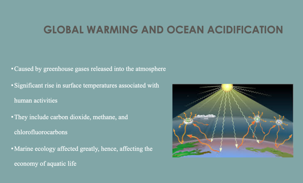
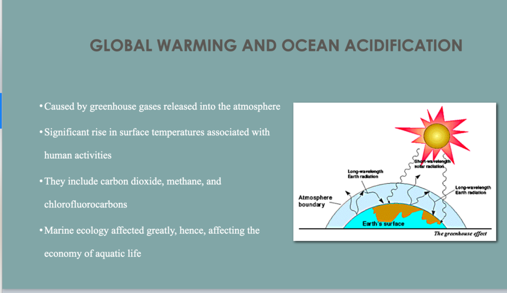
The first point I think I need to improve is the lack of coherence principle, which means removing irrelevant details. In this way, readers will not be distracted and confused. The pictures I put have nothing to do with my content. The screen capture above is my previous picture, and below is my improved image. In the picture on the left, people will not have a better understanding of global warming. So I found the picture below that help people to know deeply about global warming. After understanding this principle, I realized that a good PPT can not just describe your thoughts in words, make your PPT look more vivid with pictures. Delete unnecessary details, so that the PPT will look more concise.
The second point I think I need to improve is the lack of the Signaling Principle. I think there are too many contents in my PPT, which makes people have cognitive load. So I modified my content. I deepened the key words and deleted the unnecessary words. I also added arrows to highlight and other signals to attract attention to important information. So my ppt looks more concise and easy to understand.
Finally, I think I have improved my ability to do PPT, screen casting and interactive design from these multimedia learning principles and learning theories. Make it easier for my readers to understand what I’m saying. When I finish ppt or other multimedia objects in the future, I will pay more attention to these principles to make these multimedia objects look more professional. I think these principles people need to determine which one suits them best and achieve their goals in the best way.
Here is my updated version of PowerPoint.
2021-06-13 at 12:25 am
Hello xin, read your homework this week. First of all, I agree with the views you wrote, and found that I missed the ppt part. I will add it to my blog later. ppt is one of the best teaching aids. It can clearly show us the key points of knowledge to be learned and so on.